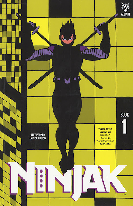
On Ninjak 2.
Hey there.
Javier here. Before starting the post, and just in case, a warning: the articles contained here are intended to be read after having read the stories, the comics themselves. The articles are a complement to that reading, and they will stay here waiting for everyone, do not worry about that. Let us begin.
In the first post, I commented that the articles would be built around
the analysis of a page or scene, and that from time to time other
work-related things could appear. Today is one of those days, I'll share
some thoughts on a key piece in the storytelling process: character. A
solid character concept is a necessary condition on the path to story,
especially when working on a series. Much of the time I spend on
approaching storytelling is devoted to this topic. The talk will be
related to the previous post, specifically the choices I made on page 6
of Ninjak issue # 1, and how things developed from there.
In
short, Ninjak was meant to be shown, fully dressed in Ninjak's uniform,
on that page 6, right in the middle of an action scene. I
talked about how the decision I made not to show the character there
changed the rest of the scene, the splash page became a double page, and
so on. The decision gave new meaning to that particular scene - it was Ninjak's introduction without Ninjak in it. And the repercussion reached not only that scene, but the entire book.
Later in the issue, in the second scene with the character inside, again, we can barely see him. The
scene takes place in such a way that he is just a black spot in the
shadow, at some point we can see his eyes, and a full shot later, but
there he fades into the background. Issue # 1, as a unit, is heavily conditioned by the fact that Ninjak is essentially not there. How would the issue have been read if we had seen it openly on all occasions, as it was meant, would it have been the same book? Ninjak is elusive, he's what he does, that's character, and that's story too.
Now,
let's try a different point of view: this time the script says that
Ninjak stays in disguise throughout the fight scene, as if the script
was written after the comic, with a meticulous description of pages and panels as they are in the book. With that being the case, more than about the character, the question would be if the comic would have been as it finally was. And the answer is no. If the script were different, my perception of the story would have been different as well, and so would the storytelling. Again, different story, same direction. In all cases, the character concept would have remained.
A
few years ago I worked on a short Ninjak story, from a script written
by Jody Houser, 'His greatest failure' (fig 1), an eight pager that was my
first experience with the character. The
script features him entering a building, killing all the guards while he
manages to go unnoticed, until he finds and eliminates the target: a
group of men and women. As scripted, we do not
see him until page 5, in a money shot of Ninjak in action, killing the
group, we will continue to see him until the end. In the way the story is presented in the comic, we don't see him throughout the entire story. Only
on the last page, double page, we see him, now outside the building, on
a roof, only on a panel, and yet hidden by the shadow of the buildings. Years later, my series editor told me that this story was the reason for her to think of me for the job. It was, essentially, a Ninjak story with no Ninjak in it.

Character shapes the story, a strong character concept may provide the ideas that will give the tale direction. But my reflections are not intended to be about the ideas themselves. Who is the one who had the ideas is a pointless discussion, one that has been used many times as a smokescreen. Idea and execution are the same thing, put on paper by the person who handles the narrative. The irrecusable discussion in comics is about language.

While in the wave of innovation, allow me to include a couple of
NOTES, regarding lettering, which I take full credit on in this issue.
To be exact, two notes and one amend.
First
note, in order to do a proper job I used a couple of type fonts provided by the
internet, I think it is fair to list them. The first is the Comicraft 'Samaritan' typeface, which makes for the basic type of the book. The
font 'Fonteys', by Fandofonts and Albert Monteys, is the other, it is
used in mental conversations, in this issue only on page 15 (fig 2.), but we will
have a lot of that in issue 3. My gratitude to all of them.
The second note is technical. It
seems that due to technical issues some of the text had to be rewritten
and the original specs, the way I make the text actually work on the
page, were not followed. The result is that on
some pages, even if the font is the same, the text in the balloons does
not look exactly like the ones I originally sent. It seems a bit more spread out and sometimes doesn't fit well with the edges of the balloons. It occurs especially in the last pages of the book, page 16 as an example (fig 2). I was told these balloons will be corrected for the trade paperback.
And
the amend. At the end of the book there is a preview of issue #3, with
the first 5 pages of the book. Please, don't take these into account,
there are several mistakes on the lettering placement that seriously
damaged the storytelling, and so the story. Hopefully, the mistakes will
be properly fixed in the final book, next month.

Fig 3.


Fig 5.
Plotwise,
the script (fig 4 and 5) establishes that Ninjak and Myna are flying in
an airplane over the Hebrides archipelago, above the island, some
boats, an old stone cottage, at some point, Ninjak prepares to leave the
plane (which he does in the next page). There's not a lot of information in
the visuals, characters basically talk and look out the windows, to see
the landscape. The weight of the scene centres around dialogue, dealing
with how Myna stole the airplane and then why they came to being there:
they're looking for Neville etc. The scene, essentially, is a epilogue
to issue #2, that is also a prologue to #3.
Now, let's get into the actual page, this time analysis willl stick to two aspects: structure and meaning.

On structure, the reading line (fig 6) will be of big help. The
introductory panel, with no border and
in black silouette, works as the door to the page, by providing the
important information: main 'character', the airplane, and the place,
the Outer Hebrides, in Scotland. From there we just follow the plane
across the page, in a journey that bring us up and down in turns around
the page, a flight that shows the skill of the pilot. But these are not
pointless twists, we fly around the two centers of interest: the island,
first, (fig 7), and the dock, with the boats, to get then into the land
(fig 8). It's a
geographical flight, in a double sense: we're physically flying around
the island at the same
time as around the actual page.


Fig 8.
Text
is placed in a way that reader always knows who's talking, even in the
cases in which we only see the airplane from afar. Color structures the
page in two clear blocks, separated by a diagonal line (fig 9), on the
left there's the sky, we see the flight from outside, on the right the
airplane get's into the land, and we get into the cockpit, experiencing
the flight from the inside. Simple, light blue-sky, brown-ground.

Fig 9.
We
keep on geography, just a couple of pages before we find another double
page that works in a similar way, pages 14-15 (fig 10). In this case,
the journey is across a hawaiian party, at the center of which there's a
pool (fig 11). The page is structured in a way that the reader walks
around the place, following a cute waitress, to get then immersed into
the pool (fig 12). It's also a geographical journey, but instead of just
physical, as in the airplane scene, it's also a conceptual one. Inside
the pool we find the evil twins, she is reading the mind of the other
persons in the pool and they both communicate mentally, so the immersion in
the pool is also the immersion into the thoughts that float above the
water.


There's
something else, another important difference, also about structure. In
the case of page 14-15 narrative brings the reader by the hand the whole
time, even when going from right to left, the reader always knows which
panel has to be read next. In page 18-19 the path is always clear except
in one case: the moment in which the airplane goes form down to up,
from the bottom to the top, near the axis of the page. It is in that
moment that reader has to choose between going up, the less natural
direction, or to the right, to what actually is the last panel of the
page (fig 13). I could have have placed the balloon right over the upper
gutter (fig 14) to make sure that the reader follows the right path,
but the moment of indecision is deliberate, another case of the
importance of text placement. It's an important moment, and the page is
structured in a way that the vertices
of the five first panels point to that exact airplane (fig 15). It's
expected that the line along with the airplane's own flight direction
will be enough for the reader to go to the panel up, instead of going
right, but, as said, it's a decision that reader has to take. Adding to
the approach of storytelling in the scene, the reader participates in the story by
experiencing the joy of 'flying solo', in a moment that elevates the
storytelling to a different level.


It's
also noticiable that this is one of the very few moments in which the
basic page structure of the book, 4x4, has been broken. These situations
indicate that something special is happening. Structure comes back in the last row of panels, at the right, in time to leave the page.
Let's get into meaning.
The
issue is structured in three scenes, the first one is the largest, 13
pages, and it basically is a fight scene, which, as it's the case, use
to mean that the weight is on visuals. The other two scenes, to which
both double pages belong, are essentially about dialogue, the weight is
on the text. In terms of pacing, for the reader it's like starting high and ending low.
The
storytelling adds a new layer of meaning to both scenes, an extra-bonus
of information that gives balance to the weight between visuals and
text. Such an approach also gives direction to the scenes, in the case
of page 18-19, it's not just about characters talking and going
somewhere anymore, they're actually flying, and reader participates in
the story by flying alongside them, in a quite virtuoso flight.
Something else. The last row of panel of the airplane page, at the
right side, situates us into the cockpit. We read that Ninjak is
preparing to leave the plane, but we can't see him clearly during the
scene, in the last panel he's putting on the mask. These panels are
meant to prepare us to what comes next: page 20, which is the first time
in the series that we get to see Ninjak, fully uniformed and in daylight (fig 16). That page, alongside the dynamic flight scene, makes for ending the issue on a high.

And
to end the post on a high, this storytelling gives shape and direction
to what really matters, yes, the experience of reading the comic.