
On Ninjak.
Hey there, Javier here.
This blog is dedicated to comic storytelling, specifically to the storytelling developed in the new Ninjak book, just released by Valiant. More specifically, I'll talk about the process that goes from receiving the script, written by Jeff Parker, to the final stage on the creation of the comic. In short, blog's about my work On Ninjak.
In an interview about the series that I did some weeks ago ( https://www.gamesradar.com/ninjak-1-and-how-javier-pulido-reminds-us-how-bold-and-daring-comics-can-be/ ), I talked about how my work process essentially consists on rewriting the story, but visually. I also commented that, in order to properly explain the work, it'd be a good idea to focus on something especific, a page or scene from the book, as a complement to the things explained there. This blog is in part about that.
The idea is that one post will accompany the release of every issue. The current post is about one specific page, including context, basic concept and formal analysis, amongst other things. The subsequent posts will keep the pattern, but the door isn't closed to any other work-related topic that could come by.
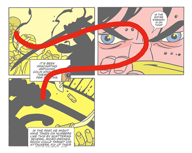
So, Ninjak issue #1, page 8 (fig.1).
 |
| Fig.1. |
Why I've chosen this page in particular is part of what this blog is about. The focus will be about the page, and the issue in general, consider this a SPOILERS ALERT. Let's start.
Step one, the script. These are the script's pages directly related to our page 8 (fig.2 and 3), script is by Jeff Parker. Important stuff, some minutes of reading is of requirement.
 |
| Fig.2. |
 |
| Fig.3. |
Page 8 is part of Ninjak's introduction scene, which goes from page 4 to page 11 of the book. The scene makes the job of presenting a new character, Myna, as well, and situation, in general. The plot, as originally scripted, runs in such a way that Ninjak gets into scene disguised with arab clothes, and later on, in page 6, he gets rid of the robes and shows himself fully as Ninjak, in a splash-page. Powerful eye-catching image bounded to make for the most important page of the book, being the scene the presentation of the character not only to the issue, but to the series. From here, he continues to fight openly in full Ninjak's uniform.
The first stage in my process consists on repeated readings of the whole script, as many as it takes until I feel I own it, that is, until I can tell the story just by myself, without script or notes. It's only then that I'm able to evaluate ideas and taking storytelling decissions. So, during one of the readings an idea came to me: in a situation like the one presented, Ninjak would not show himself in that way, he'd choose to continue in disguise. With that being the case, we'd have a Ninjak's presentation scene 'without' Ninjak into it, which sounded like perfect Ninjak material to me. Then concept changed it all.
Page 6 extended to page 7, by becoming a double spread-page which was more about placing readers in a situation than impacting them through eye-catching visuals. A pause more than a punch. A big title+credits tablet completed the spread, along with another, small, panel which work as a hook, a page-turner.
A big part of the information originally contained in page 7 was then pending relocation. The information was basically about the way Ninjak 'works', then and now, we see the now through the image, the captions explain the differences with the then. From there the script gets deep into the character's history, through more captions and flashback images. The action keeps in background until the last part of the scene, pages 10 and 11, in which the fight takes the whole place.
So I started to play around the material. For the sake of clarity, it seemed that separating the components was priority, especially because the captions would be placed all around. I found that the image that would take the role of the original splash-page, the first time we really 'see' him, was there too. I had him, along with what he does and how he came to be. At some point something clicked.
Coming back to what the scene was about, introducing Ninjak, I realized that page 8 was meant to take the role of original page 6. It'd be Ninjak's presentation page, but instead of some eye candy, the reader would get him, his work and his history, the whole pack all in one page. The trick would be on finding a way to stablish the right hierarchy.
 |
| Fig.4. |
The page's structure keeps on the 4x4 book's basic structure, but making it a 4x2. The info is distributed in two vertical rows: the left one is about what ninjak does, being the right one about who he is now and how he came to be (fig.4.). The graphic treatment is designed to make every part distinctive and connected to the rest of the page at the same time.
 |
| Fig.5. |
 |
| Fig.6. |
With regards to drawing, black Ninjak's silhouettes for the left row (fig.5), while on the right one we have two borderless panels, with some grey areas into them, and two face-shots: 5 and 8 are essentially the same panel, only that in panel 8 the character's leaving the page (fig.6.).
Colors keep one same basic scale for all panels, but at the same time every part is clearly separated: yellow on the left, orange on face-shots and no color on flashback panels (fig.7.), while blue eyes are directing readers's eyes across the right row, from top to bottom (fig.8.).
 |
| Fig.8. |
 |
| Fig.7. |
Layout manages to reflect the expositive (captions) and active (action) nature of the content as well: two vertical blocks crossed by a diagonal line form top left to bottom right (fig.9.).
 |
| Fig.9. |
The lettering placement is very important in the way a page reads, in the case of this particular page it's just key, I'll address it later on. For now, I'll say that the lettering placement respects the two-rows's structure, with a different approach on each one of them. On the left, one the captions are placed in the row's central axis, while on the right one letters are placed following the blue eyes's line I mentioned before, when talking about colors (fig.10).
 | |
| Fig.10. | |
The text included in the captions on the left row was gracefully reduced at the last stage, which gave some more air to the drawing. Also, there's a small head accompanying the text in the first caption, it's Myna, watching the scene with binoculars, coming from previous pages. That's a device
originally used to identify who's talking, or thinking in this case,
without the need of playing with letter fonts, colored captions or that
kind of things. We'll be seeing more of these in future issues, on
different uses.
This is a general view regarding formal analysis, what the eye can see. Let's see now how the page actually works.
The panel which should be panel 2 is actually panel 5, by way of breaking the natural reading order: the panel is attached to the panel below it by a caption located right between them. Purpose is that reader will still 'read' first the panel beside panel 1, even if just by glance, if not the text certainly the image (fig.11). And the same thing will likely happen again on further reading of the left vertical row, precisely because of the natural reading order (fig.12).
 |
| Fig.12. |
 |
| Fig.11. |
By the time the reader actually reads panel 5, it'll be like the third or fourth time that the panel is read. The plan is that the trick will give a special importance to that panel in the reader's mind, so that the image will somehow remain during the reading of the page. Other visual devices, such as being the only panel in which the character actually talks, that the character is looking at 'us', or some extra-detail in color, add extra-weight to the panel as well.
The goal is that the panel and the page are presented as being both equally important, as they both are one and the same thing: Ninjak's presentation.
As a curiosity, this is the original layout for the page (fig.13) .
 |
| Fig.13. |
To end, and as a summary, page 8 is important because in it we introduce Ninjak, to the issue, and to the series. But, above all, page 8 is important because it exemplifies the kind of invisible choices and storytelling decissions that give shape and direction to what really matters: the experience of reading the comic.
ON NINJAK will be back in one month.
