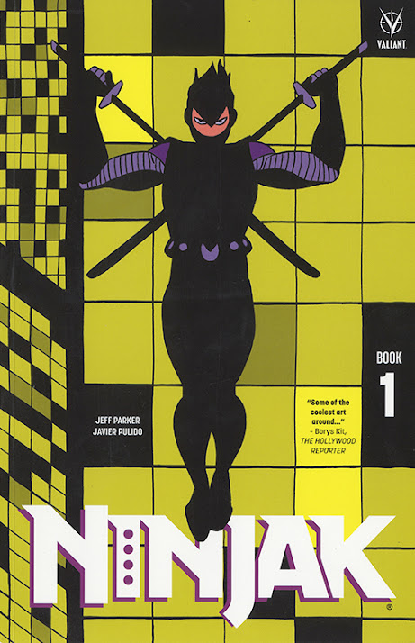
On Ninjak, the book.
Hello everyone.
It's been a while since the last post, which was meant to close the blog, but. Recently the trade paperback containing the three issues I worked on came out, it's the final form of the work and there are a few new changes I want to comment on, along with the overall editing. Also about some things that were pending.
So, let's start with the...
Figure 1
Cover.
Unlike the comic-books, the tpb has a drawing done by me on the cover (fig. 1). It's one of two illustrations I did for publicity use at the beginning of the project, before any interior art was done, and as such was not intended to be a cover. Still, it does a pretty good job at it, and I take the change of approach as the acknowledgment of a mistake.
Interior.
The
book delivers worst and glossier paper stock, but color is actually
better reproduced than in the comic-books, at least in the copy I have (fig. 2, the right one is from the tpb). Also, not having advertisement, the pages can be read in the way that they were conceived.
Figure 2
There were some small mistakes in the lettering of issue #1, four or five, the kind of balloon tails that should touch the panel border and don't, others that uncalledly go out of panel, those have been fixed for this edition (fig. 2 as well).
There's another change in the lettering of the issue that doesn't follow the same logic, or any logic at all. In page 15, the first panel is structured so that there's a Ninjak's shadow at the top, on the wall in the background, Ninjak is coming from above, out of panel, balloon tail points to that direction (fig. 3, left side). The characters in the panel are looking up, to Ninjak out of panel, Myna in the small text box, and the guy in the next panel are looking at the same direction as well (fig. 3, right side). One of Ninjak's swords in the shadow crosses above a window, it's drawn on purpose in a way that makes evident that it's a shadow, not a silouette (fig. 4, left side). Before starting any definitive drawing I deliver very complete page-layouts for approval, the way that the balloon was meant to be located was, of course, included in the page-layout (fig. 4, right side).
Figure 4 In the tpb this has been 'fixed', the balloon comes out of what is now a
talkative shadow, and so the other characters look up, outside the panel, at nothing (fig. 5). The origin of such contribution to storytelling is unknown to me but, coincidentially, it reads as if the shadow has an opinion in the mattter.
As far I can see, issues # 2 and #3 keep the same, so the lettering mistakes and uncalled changes that I pointed out in previous posts remain.
Issue #4 keeps the same as well. About this, and some related topics I want to make some...
Remarks.
Anyway, even with the changes pointed out here and the other posts, I think that the first three issues are worth it. They really add to what's been my work to date.
If
someone didn't buy the tpb because I wasn't treated fairly,
and being deeply grateful for the intent, I'd ask to reconsider and
maybe find a different way to show opinion on it. Enjoying the work, and
if that's the case spreading the word, might be an effective way to do it.
Thanks for reading, hope to see you soon.
Javier


